My Work- Year 1
|
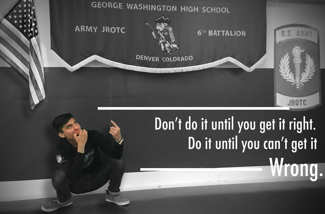
Inspirational AdWe used the lack of colour in order to draw attention to the student while using the black and white filter to make it less eye-catching. We included the American flag and the JROTC in the shot to show commitment and hard work to success. Finally, our quote is based on other quotes similar in words and placed it in the bottom third of the photo to draw attention to there as well.
|
|
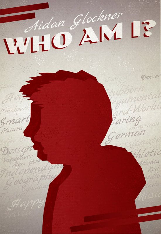
Who Am I PosterI wanted the Who Am I project to reflect different aspects about me. I used mainly red to show that the colour red represents me. I also used a flat, graphic style, and a vintage poster style to reflect my liking for those two graphical styles. I used Illustrator to create most of the poster, like the actual silhouette, the gradients, the red lines, and all the text in the design. I then went over to Photoshop to finish it with textures for the background and the silhouette, and the faint splatters of paint decorating the empty spaces.
|
|
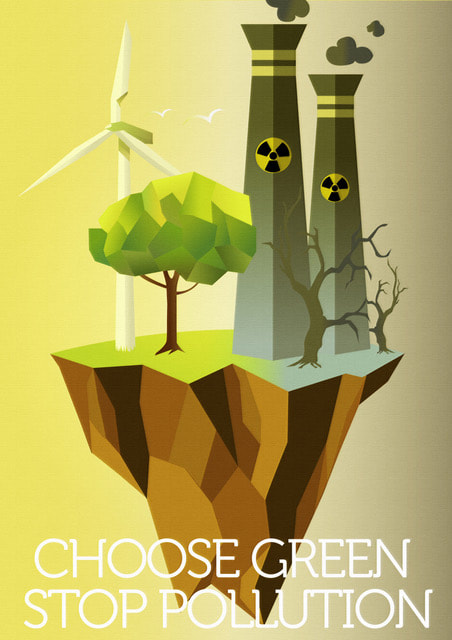
Global Issue PosterFor my issue poster, I chose an environmental focused design. I thought that a simple design with flat colours and gradients would be the way to go, as a standout from other environmental posters. My poster focuses on the windmill, tree and grass, as a way to represent what the world was like, and what it could be if we change our direction of energy.
We could have a lovely, green world where everything is peaceful and calm. The right side of the poster focuses what the Earth might be if we stay in this direction. Dead nature, with pollution and dead buildings covering the land, and not much nature to be seen, save for the dead and twisting trees. |
|
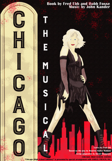
Chicago Musical PosterIn our School Musical Poster, I wanted it to have a graphic style, meaning it's similar to vector images and such. I also decided to have a more vertical orientation (based off the sign from the Mayan Theatre in Denver, Colorado) to differ from most of everyone else's creations, which are horizontal. I used a colour theme of red, black, dark grey and tan.
I also included the Chicago skyline in the background as a representation of the play's name. The main centre of the piece is one of the main characters of the play who is standing in a Broadway-style pose, created from vector shapes from Adobe Illustrator. |
|
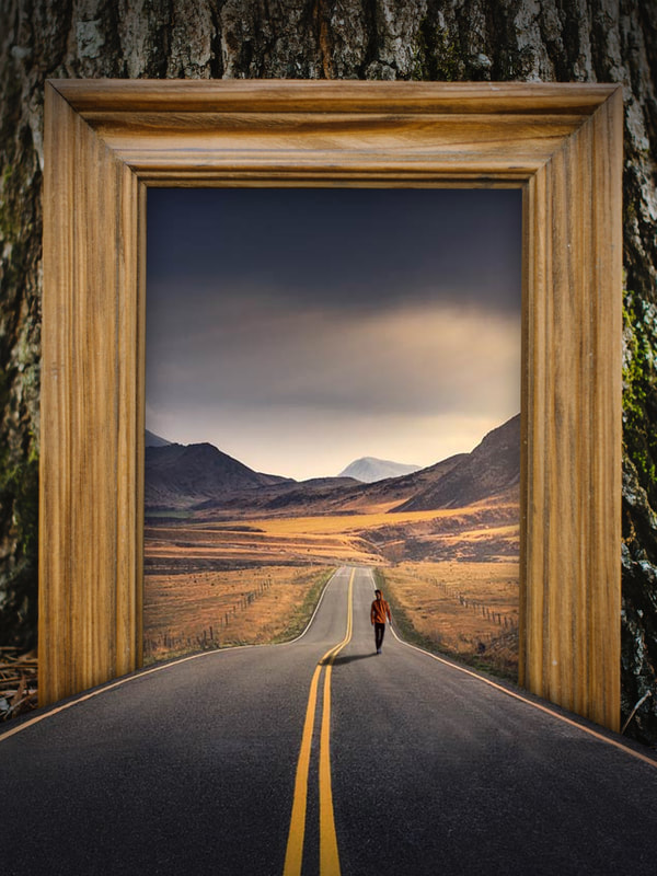
Illusion ProjectFor the Illusion project, I created a picture frame in a forest, leading to a mountainous valley with a winding road. I also included a person walking along the empty road with a long shadow as it's early evening. The second part of the illusion is the road extending out of the picture frame and into the forest to create a connection between the two places. The rule of thirds is in place here, as the road takes up the bottom, the man and the landscape the middle, and the top is mainly empty, save for the frame top.
|
|
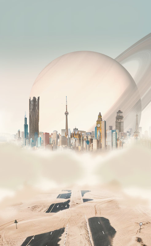
Fantasy Landscape ProjectFor my Fantasy Landscape project, I used the rule of thirds to help determine where the roads, the city, and the planet are. I chose a tan filter with a sandy desert road leading to a fictional city, blanketed by thick clouds. The planet orbiting in the background is the larger of the two fictional planets, which also makes a very nice photograph.
It creates a desert world where the sprawling capital is a collection of buildings and landmarks, some of which are from cities on Earth, being looked upon by the gigantic planet sitting in the background of the sky. |
|
|
|
|
GW Shirts Project
For this project, we had to create three different t-shirt designs for GW. I created one that was a small play on the normal George Washington logo. I just rotated the 'e', 'r' and 'e' a to the left, and created a stroke outline for the whole thing. For the second one, I basically took one of the GW logos and added another stroke. I put it on a white background because the colours fit kinda well. Finally, the one I like the best is where I used the masking and cutting tools to loop the G & W into each other, with each having a different colour stroke.
|
|
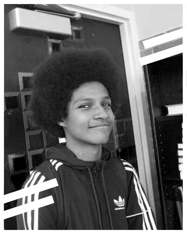
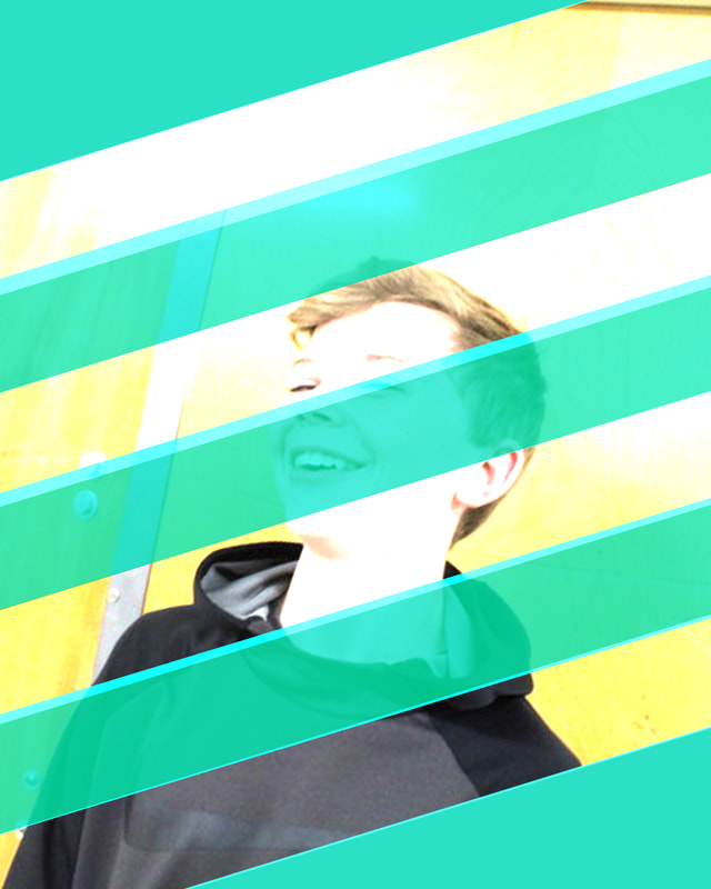
GW Faces Project
For the GW Faces project, we had to find three people and take a photo of them and try to create the design to fit their story. For Tyler, I chose a plain black and white filter and the diagonal white lines as a sign of abstractness and calmness. For Sam, I took a more vibrant approach which I felt fit his personality more, with crossing turquoise lines as a sign of creativity and friendship.
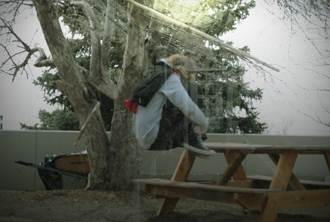
Floating Project
For the floating project, I was originally just going to have floating people and a few objects, but for whatever reason, the camera didn't end up focusing, and the image was blurry. I then used this to my advantage as I made it appear as if the picture was being taken through a greenhouse window.
I used layer masks and blending modes, with colourization to create the window effect. I also used layer masks to create a floating effect for the two sticks and person. I created a gradient to gain a shadow from the bottom up, to make the lighting more realistic. Finally, I used some lens correction and colour filters to add the process effect.
I used layer masks and blending modes, with colourization to create the window effect. I also used layer masks to create a floating effect for the two sticks and person. I created a gradient to gain a shadow from the bottom up, to make the lighting more realistic. Finally, I used some lens correction and colour filters to add the process effect.
|
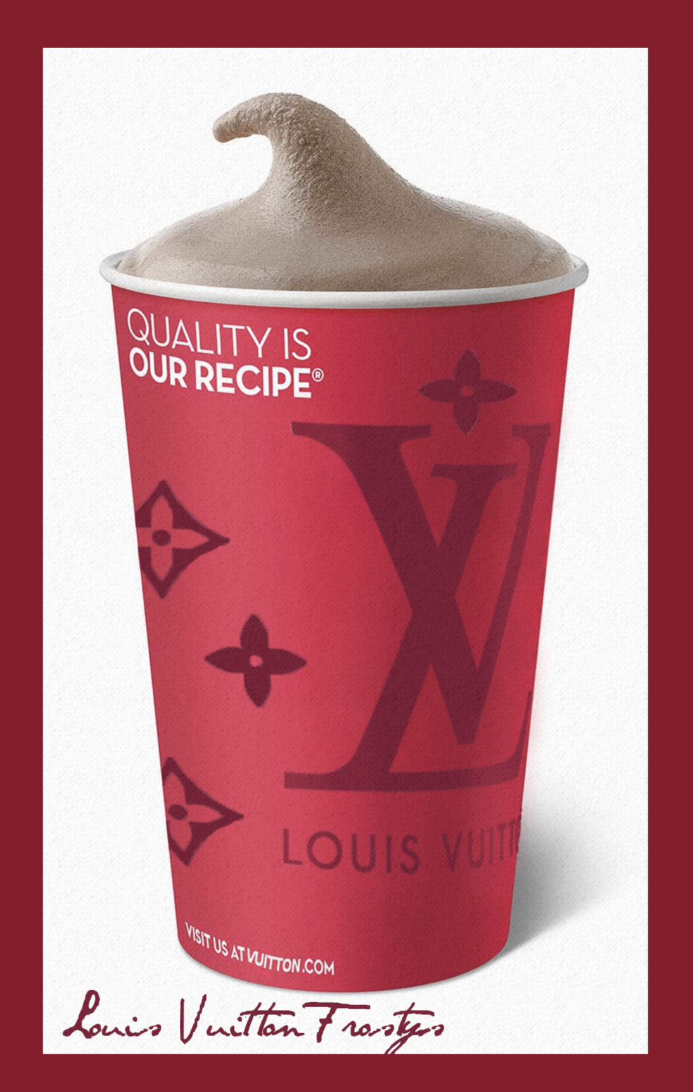
Competition #1 - Brand MergingFor my first submission, I chose to combine Wendy's Frosty's with Louis Vuitton. I first removed the Wendy's logo with the Spot Healer brush (content aware/proximity match) and then blended it together with the Blur brush. I added slight highlights to the right side using a mostly-transparent pink-coloured Paint brush. I then placed the Louis Vuitton logo, along with symbols from their pattern on top of the cup, using the warp feature to bend each shape to the curve of the cup. Finally, I added a red border and red text stating the product in a fancy, handwritten, cursive font.
|

|
Competition #2 - Logo RedesignFor the second competition, I redesigned Amazon's logo. I chose to take the 'a' and the 'z' of the original logo, and merge them together to create the new one. I chose this design to evoke simpleness and efficiency, both staples of Amazon's brand. I also used the traditional orange arrow coming off the 'z', pointing to the right to show forward movement, and progress for the future.
|

Final Project
For my final project, I chose to use the dog requirement. I wanted to make a modern looking animal logo.
